
יום שישי, 30 באוקטובר 2015
יום חמישי, 29 באוקטובר 2015

יום רביעי, 28 באוקטובר 2015

Dodging and Burning
One off the key factors in making a believable composite is to handle how the light falls on your elements. One of the best ways to wrangle the light is through dodging and burning.
Here is a recent composite that I created.

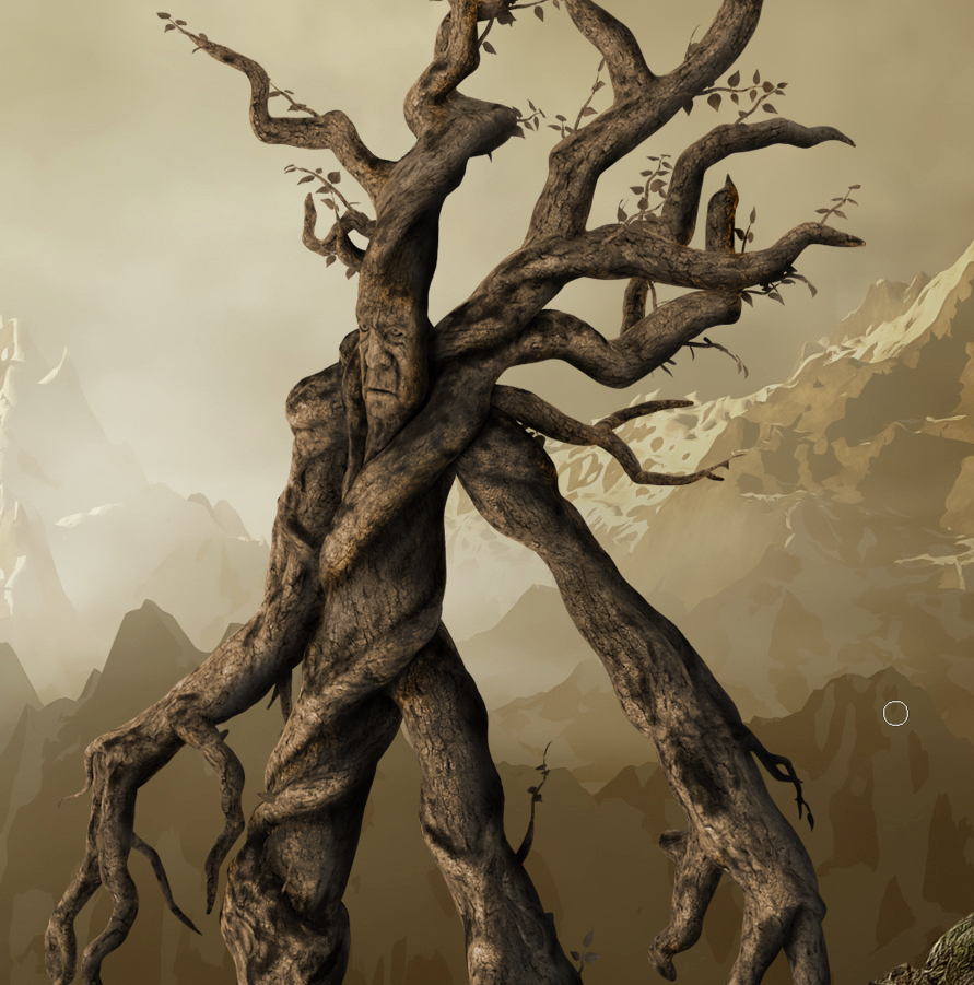
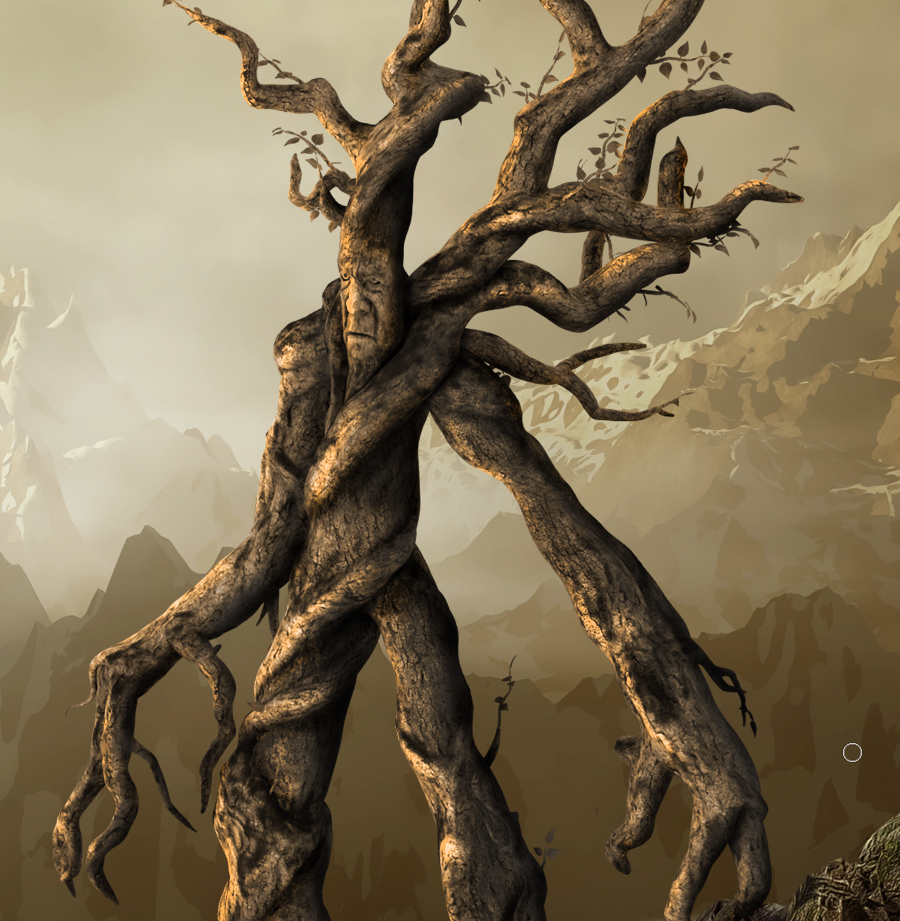
We are just going to focus on the Ent creature on the right side. Here is what he originally looked like when downloaded from pixelsquid.com and the following one is what he looks like after dodging and burning.
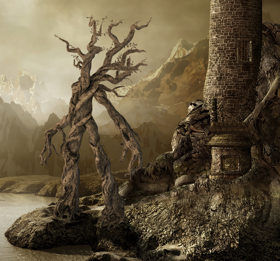
The original element is pretty good, but the contrast and shadowing are not quite right
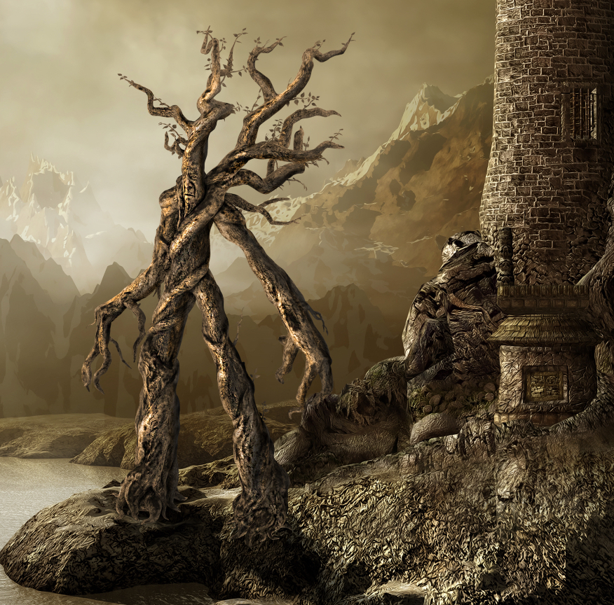
Here is the same element after dodging and burning
Hopefully you can see the difference in the original and the final result. This allows the viewers eyes to accept the element into the scene more readily. So how do you know where to dodge and burn?
Once you place an object into a scene and get it positioned where you want it… then you will want to make sure the highlights and shadows work with the rest of the image, but how do you know how it should look?. If we take note of the lighting and contrast of the castle in the background image, we see that our Ent is a little flat when compared to the shadows on the castle. We are giving all the visual clues we need by the shadows and especially by the rocks on the water, that help us figure out the light direction and intensity of the shadows. Pay attention to the darkness and the fall off of the shadows. Your goal is to match the look of those.
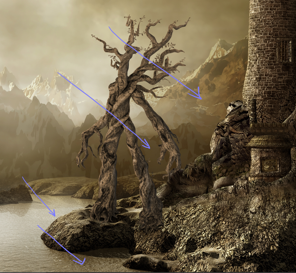
using the shadows on the water help set the angle of the light
There are several ways to dodge and burn, and depending on what day it is, I will use a different method… but for this example I simply made a copy of the Ent layer by pressing Command-J (PC Ctrl -J) and then hid the original Ent layer to use for a backup if I screwed up. I am going to use the dodge and burn tools in the way most folks will by applying them directly on the element, but I don’t want to be trapped if somewhere along the way I mess up. Also in the end I can change the opacity of the dodged and burned layer if I get to heavy handed and blend it with the original layer for a more natural look.
I tend to start with the shadowing… so I grab my burn tool (O) and work from light to dark. In the options bar I choose highlight and set my Exposure fairly low… usually under 12%. This will allow me to slowly build up the burning and mainly focus on the lighter areas. This is also very handy when you have a few little white jaggies left over from a selection because it is only going to try to darken the lightest parts and leave the rest of the image alone.
If you use a brush with a very soft edge, then you can start painting just on the edge and there will be more of a gradient than a solid line of burning. Now you will want to think as if this object is actually three dimensional and how it would be lit if it was in this space. What light would make it onto the body and what parts would be in shadow. I will draw little direction lines on a separate layer like the image above to help remind me of the direction. The key to dodging and burning is patience… which is a word that I am not a fan of… but I have tried to rush through this process and I end up having to redo it more slowly the second time around, so in a sense slow is fast. (Shooter reference for those of you playing at home. 
There might not seem like a lot is happening with the highlight burning, but it is important because it brings those pesky light areas up to a tonal darkness that will allow the midtones burning to affect them. Nothing screams fake like a couple of bright edges where shadows should be, so practicing good highlight attention will pay off in the end.

There are subtle changes to the shadows in this image... but don't fixate on this image... the next one is where more of the action is.
In the options bar, change to the Midtones so that they will be the area affected by the burning and leave your Exposure at a low setting.

change the settings to Midtones and keep Protect Tones checked
Now you will begin to see a more dramatic affect of burning, because most of your Ent’s brightness is in the mid-tone range. Slowly trace down the edges of the Ent that would be in shadow and the follow the contour of the body to help emphasize a roundness and not just a flat creature. This is what will take a lot of practice, but it will make your elements work so much better in the long run.
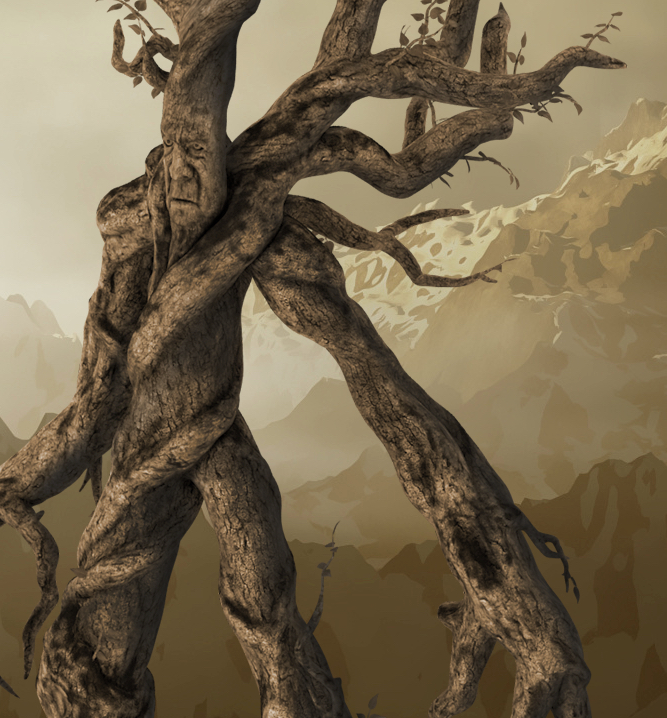
now the edges are starting to feel more rounded and the shadowing is helping to add contrast to the Ent
You will want to finish with the tool set to Shadows, and this will bring in the darkest burning so it needs to be handled gently. I will often bring the Exposure setting down to about 4% or so, this may mean that I have to apply more strokes, but it helps to keep from making the image too muddy. (Sidenote: depending on your style and skill level with each step, you may want to create a new copy of each burning phase as a backup before you move to the next setting.) Really try to match the darkness and look of the shadows that are falling on the rest of the image. There is a level of artistry here and it is where most folks get lazy or frustrated and they abandon the process because it looks weird or it is too much work. But, if you will push through and be ok making a mess the first dozen times you try this, you will begin to get the hang of it and things will start to become more natural and faster… I promise.
now the Ent has some much darker areas and shadows... all that is left is some highlights
The payoff for all of this usually comes when you switch to the Dodge tool and add some highlights. It is the combination of dark shadows with bright areas that gives us contrast and makes the image pop. Remember dark areas are read by our eyes as receding and bright areas as coming forward, so two dimensional images can only look like they have mass and take up space in a image through contrast. Most of the time you will only need to set the dodge tool to Highlights and paint with a low Exposure setting over the lightest areas that you have left. If you have done your shadowing correctly, then it should be fairly easy to see where to paint. Remember that it will always be on the opposite side of the shadows… so since the right edges are in shadow, then you will want to increase the highlights on the left edge of the Ent. Just like with everything else… go slow and softly build up… thinking how the light will fall across the body.
notice how the addition of highlights really makes things pop
When you are done, make sure to zoom out and see how it sits within the space… you will probably need to go back in and adjust some areas. Remember that if you have the original layer, that you can mask out parts of the new dodged and burned layer or decrease the opacity to take away any over the top areas.
Dodging and burning is an art, and a lot of folks (myself included) would rather spend time doing other things… but almost nothing else can hinder you composites than bad lighting on your elements. Don’t cut corners and don’t be lazy and in the end you images will start to really standout. I have given you a few tips and a look at my process, but you will need to practice… practice… practice. That reminds me… I need some practice too.
יום שני, 26 באוקטובר 2015

יום שבת, 24 באוקטובר 2015
Christmas with the Robesons | Vlog 1
Subscribe to my channel: http://www.youtube.com/user/robesondesign?sub_confirmation=1
Subscribe to Sharrah's channel:http://www.youtube.com/user/robesondesignstudios?sub_confirmation=1
Christmas Decorating is our favorite thing to do at Robeson Design. 2015 will be our best year ever as we create 25 NEW Videos of Christmas Decorations and Christmas Decorating ideas and inspiration for you, our viewers of over half million subscribers! Interior Designer Rebecca Robeson and Fashion Blogger Sharrah Robeson bring you the most beautiful Christmas decorating ideas for 2015. 25 Videos will be uploaded daily between the two channels bringing ideas to all generations and every budget in between. Make it fabulous... even on a budget. Guest appearances by Scott Robeson will bring it all to life as this family kicks it into high-gear for Christmas 2015.
INSTAGRAM: http://instagram.com/robesondesignteam
Click here to go to our website:
http://www.robesondesign.com
Click here to go to our Facebook:
http://www.facebook.com/RobesonDesign
Follow us on HOUZZ:
http://www.houzz.com/pro/rebeccarobeson/__public
Directed and Produced by Robeson Design.
Videography by Matthew Moran
Editing by Dorian Tucker
All exclusive music provided by Jimmy Robeson
https://robesonproductions.bandcamp.com/
Royalty free music by Epidemic Sound
Art In Apple Birds | Fruit Carving Garnish | Apple Art | Party Garnishing
Learn How to quickly Cutting Apple into Birds.
http://paulartcooking.blogspot.nl/2015/10/learn-how-to-quickly-cutting-apple-into.html More Pictures: http://paulartcooking.blogspot.co.uk/2015/07/art-in-apple-flower-fruit-carving.html
Recommended What to Watch:
Art In Apple Lucky Stars | Apple Art | Fruit Carving Apple Garnishes
https://www.youtube.com/watch?v=pGvo5Dn8UW4
Art In Apples Show - Fruit Carving Apple Secret Lucky Star ★ Garnish ★ https://www.youtube.com/watch?v=147vePB5Arc
Art In Apples Show - Fruit Carving Apple Leaf - Fruit Carving Garnish - Fruit Decoration https://www.youtube.com/watch?v=HLQdhUUKH4Y
Art In Apples Show - Fruit Carving Apple Rose | Fruit Decoration
https://www.youtube.com/watch?v=TWidtwZCfzg
Art In Beetroot Rose Flower | Vegetable Carving Garnish
https://www.youtube.com/watch?v=dAgWeXx7jwM
Art In Cucumber Tomato Show - Vegetable Carving Rose Garnish
https://www.youtube.com/watch?v=4ZsIBB0V79s
Art In White Radish Rose Flower | Vegetable Carving Garnish | Roses Garnish https://www.youtube.com/watch?v=RnQxNoa7PPk
Art In Vegetable: Onion Carrot Cucumber Flowers Show https://www.youtube.com/watch?v=EnOATaaZ6Ls
Art In Potato Rose Flowers | Vegetable Carving Garnish
https://www.youtube.com/watch?v=ueRGNF1awP0
Art In Potato Flower Garnish - Vegetable Carving - Potato Roses https://www.youtube.com/watch?v=msir3AJsyIY
Art In Strawberry Flowers | Strawberry Art Red Flower | Fruit Carving Strawberries Garnishes https://www.youtube.com/watch?v=j4N1nZBjEuI
How To Make Cucumber Rose Flower | Vegetable Carving Garnish https://www.youtube.com/watch?v=mBSShWIB2Ao
Art In Carrot Show - Vegetable Carving Carrot Roses - Carrot Flowers Garnish https://www.youtube.com/watch?v=jsPWupXVfJM
This is a music license (Imagination) agreement
Capo Productions.
We Think You'd Like:
Art In Carrot Show - Vegetable Carving Carrot Flowers - Creative Garnishes
https://www.youtube.com/watch?v=pzFPUyBkGik
Art In Carrot Show - Vegetable Carving Carrot Roses - Carrot Flowers Garnish
https://www.youtube.com/watch?v=jsPWupXVfJM
Art In Carrot Show - Vegetable Carving Carrot Flowers - Carrot Roses Garnish
https://www.youtube.com/watch?v=9EnchawJ3pA
Art In Banana Yellow Duck Car | Fruit Carving Garnish | Banana Garnish
https://www.youtube.com/watch?v=H29AAi9nwLU
Art In Butternut Pumpkin Flower Basket
http://www.youtube.com/watch?v=6FF_u5sHrzU&list=UUq459gYt1ntD8waAncLCOyw&feature=share
Art In Cucumber Tomato Show
http://youtu.be/4ZsIBB0V79s
http://www.youtube.com/watch?v=mKd9C1Qanwk&list=UUq459gYt1ntD8waAncLCOyw&feature=share
How to Make A Carrot Flowers - Valentine's Day Specials ♥
http://www.youtube.com/watch?v=osevGP_sNgQ&feature=share&list=UUq459gYt1ntD8waAncLCOyw&index=1
Radish Flower | Cucumber Leaf
http://www.youtube.com/watch?v=Poce94U3OjA&list=UUq459gYt1ntD8waAncLCOyw&feature=share&index=2
Art In Carrot Show-Carrot Butterfly - Carrot Heart - Carrot Stars! ABCD Carrot
http://www.youtube.com/watch?v=3LIV3UHJ_mk&feature=share&list=PLZilaPArzjsXXNPxk-mbFVOVKig1WRBYY&index=2
http://www.youtube.com/watch?v=Wa0topB8DAw&feature=share&list=PLZilaPArzjsXXNPxk-mbFVOVKig1WRBYY&index=3
http://youtu.be/jsPWupXVfJM
http://youtu.be/9EnchawJ3pA
Art In Cucumber Show - The Leaning Tower of Pisa
http://www.youtube.com/watch?v=G78MJ-sRX80&feature=share&list=PLZilaPArzjsVuawb4og3CAPvZYbw_KAij&index=1
Art In Tomato Rose- Vegetable Carvings into Rose Flower
http://youtu.be/v5y-xqx4WLI
Art In Tomato Swan - Vegetable Carvings into Swan
http://youtu.be/doA3FANlIiY
This is a music license (Sunshine) agreement
Capo Productions.
The Art of Vegetable and Fruit Carving
© Original works by ItalyPaul
http://www.italypaul.co.uk
יום שישי, 23 באוקטובר 2015

יום חמישי, 22 באוקטובר 2015
A little compositing inspiration
In case you didn’t read last weeks post about PixelSquid, I thought I would entice you with a little composite I put together today. Everything is from PixelSquid except for the background. It is so easy to bring things in and manipulate them into place when you add the PixelSquid plug-in into Photoshop. Couple of things to know about the plug-in… anything that you check to add to Photoshop will load into the Windows>Extension>PixelSquid library and hold up to one hundred objects in the Library at a time. Any new objects past one hundred picked will replace the oldest objects… so you can’t download all 4000 plus images into your library. What you can do as a way to get access to as many images as possible is download any and all of the images as either a .psd or a .png onto your harddrive. Even after the beta testing period is done, you will be able to go back to the website and download any new angles of that object for free. (since PixelSquid keeps track of what you downloaded and will keep giving you access.) Until I learned this, I was downloading every angle I could think of and it was killing my storage… but the objects were so good, that it was worth it.
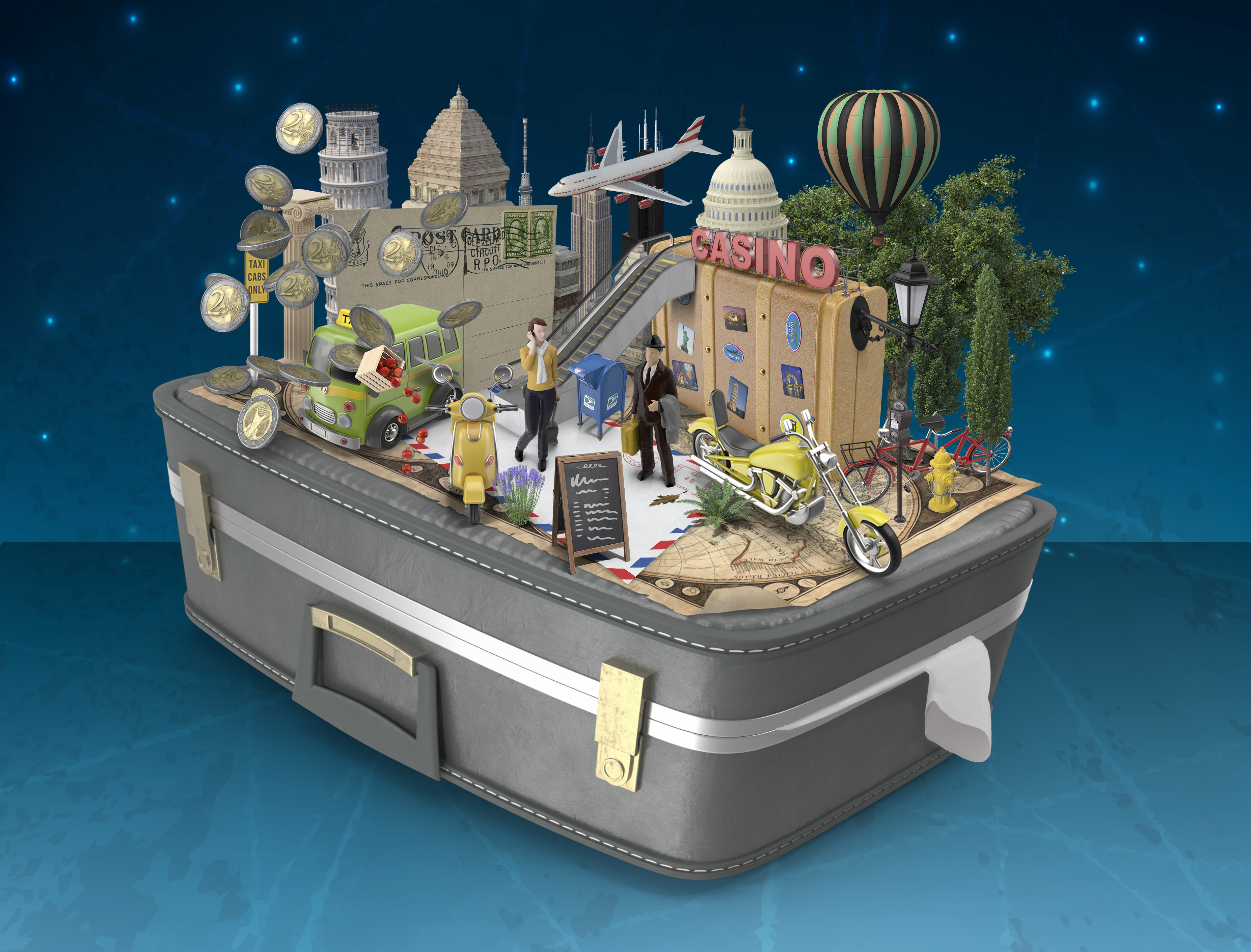
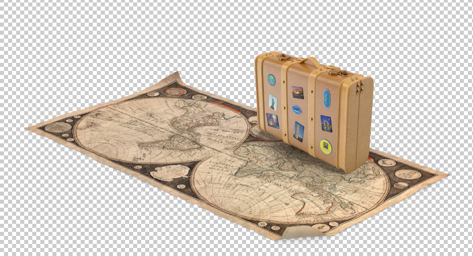
Now here is how I work with PixelSquid currently. For this composite… I did a travel search and started with the suitcase and the map as the base, and then built everything up from there.
I went through the website and selected a bunch of items that I thought would work and checked the add to Photoshop for each one of them. Then over in Photoshop and in the PixelSquid Library, I simply clicked on the item I wanted and it loaded into its own layer, and then kept the window open for me to rotate the image around to fit and then go from a low-res image to a high-res one or download a .psd. So getting your objects to fit and line up is really pretty easy. Now, if you find that an object needs a little more rotation or tweaking, simply Free Transform or use any of the other filters in Photoshop such as warp or puppet warp to help.
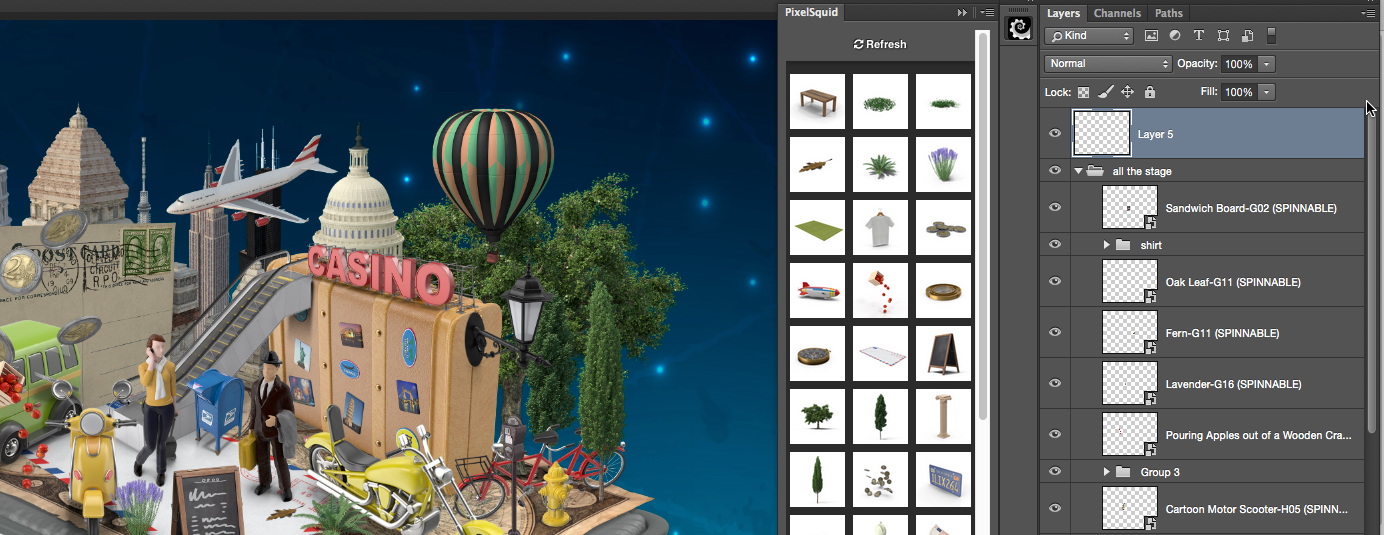
The library showing the different elements ready to be used with a simple click

Here is the adjustment window that you can rotate the object
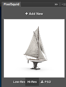
Here the boat is rotated and the Hi-res version is applied
It really has been one of the most painfree ways of adding elements to a composite that I have experienced. So strike while it is almost to good to be true and get some amazing stock objects at PixelSquid.com
יום שלישי, 20 באוקטובר 2015
Easy Slime Text Effect
This tutorial will show you how to use Photoshop’s layer styles and some simple textures to create an easy, detailed slime text effect.
Tutorial Assets
1- Double Feature font.
2- Ice Texture 4 by CageyResources.
3- Black Mamba Pattern by Federica Pelzel.
4- PS Patterns – Of all things fleshy by halmtier.
5- You’ll also need to load a default Photoshop Contours set. So go to Edit > Presets > Preset Manager, and choose Contours from the Preset Type drop down menu. Then click the little arrow to the right of the Preset Type drop-down menu, and click Contours near the bottom of the pop-up menu. When the dialog box appears after that, just click Append, and you’ll get the Contours set.
Step 1
Create a new 850 x 550 px document, place the Ice Texture 4 texture on top of the Background layer, and resize it as needed.

Double click the Ice Texture 4 layer to apply the following layer style:
- Inner Glow
Blend Mode: Vivid Light
Opacity: 35%
Color: #ffffff
Source: Center
Size: 250

- Color Overlay
Color: #bfeb8c
Blend Mode: Color burn
Opacity: 55%

- Gradient Overlay
Blend Mode: Color Burn
Check the Dither box
Opacity: 50%
Style: Reflected
Scale: 125%
Click the Gradient box to create the gradient using the colors #ffffff to the left and #d7d7d7 to the right.

This will add some coloring to the background texture.

Step 2
Click the Create new fill or adjustment layer icon at the bottom of the Layers panel and choose Levels.

Click the Clip to layer icon, and change the Gamma value to 1.04.

Select both the Ice Texture 4 layer and the Levels layer, duplicate them, then go to Layer > Merge Layers.
Rename the merged layer to High Pass, then go to Filter > Other > High Pass, and change the Radius to 10 px.

Change the High Pass layer’s Blend Mode to Soft Light. This will sharpen the texture a little bit.

Step 3
Create the text using the font Double Feature. The Color is #72a726, the Size is 250 pt, and the Tracking value is 25.

Duplicate the text layer and change the copy’s Fill value to 0, then duplicate the copy layer three more times.

Step 4
Double click the original text layer to apply the following layer style:
- Bevel and Emboss
Depth: 130
Size: 25
Soften: 9
Uncheck the Use Global Light box
Angle: -18
Altitude: 58
Gloss Contour: Cone – Inverted
Check the Anti-aliased box
Highlight Mode: Linear Light
Color: #ccb89c
Opacity: 50%
Shadow Mode: Color Burn
Color: #37462c
Opacity: 50%

- Contour
Check the Anti-aliased box.

- Inner Glow
Blend Mode: Vivid Light
Opacity: 100%
Color: #fcffeb
Technique: Precise
Source: Center
Size: 250

- Gradient Overlay
Blend Mode: Multiply
Click the Gradient box to create the gradient using the colors #d7d7d7 to the left and #ffffff to the right.

- Outer Glow
Blend Mode: Linear Light
Opacity: 65%
Color: #b4cc43
Size: 10

- Drop Shadow – 1
Color: #8db354
Uncheck the Use Global Light box
Angle: 91
Distance: 58
Size: 15

- Drop Shadow – 2
Color: #9dbe6b
Uncheck the Use Global Light box
Angle: -67
Distance: 36
Size: 15

This will style the first layer of text, creating the basic detailing, highlights, and shadows.

Step 5
Double click the first copy text layer to apply the following layer style:
- Bevel and Emboss
Depth: 135
Size: 9
Soften: 3
Uncheck the Use Global Light box
Angle: -35
Altitude: 26
Gloss Contour: Rounded Steps
Check the Anti-aliased box
Highlight Mode: Linear Light
Color: #d7c8b4
Opacity: 75%
Shadow Mode – Opacity: 0%

- Contour
Contour: Ring – Double
Check the Anti-aliased box.

This will style the dripping parts, as well as the edges of the text.

Step 6
Double click the second copy text layer to apply the following layer style:
- Bevel and Emboss
Size: 38
Soften: 2
Uncheck the Use Global Light box
Angle: 171
Altitude: 58
Gloss Contour: Cone – Inverted
Highlight Mode – Opacity: 70%
Shadow Mode -Color: # 95c333

- Contour
Contour: Cone – Inverted
Check the Anti-aliased box.
Range: 100%

- Texture
Pattern: Black Mamba
Depth: 95%

- Inner Shadow
Blend Mode: Linear Dodge (Add)
Color: #222221
Distance: 6
Size: 6

This will add more texturing to the text.

Step 7
Double click the third copy text layer to apply the following layer style:
- Bevel and Emboss
Depth: 135
Size: 27
Soften: 7
Uncheck the Use Global Light box
Angle: -70
Altitude: 25
Gloss Contour: Ring – Double
Check the Anti-aliased box
Highlight Mode: Linear Light
Color: #feffec
Opacity: 75%
Shadow Mode – Opacity: 0%

- Contour
Contour: Ring – Double
Check the Anti-aliased box.

This will add some more highlights and glossiness to the effect.

Step 8
Double click the fourth copy text layer to apply the following layer style:
- Bevel and Emboss
Depth: 135
Size: 13
Soften: 1
Uncheck the Use Global Light box
Angle: 180
Altitude: 42
Gloss Contour: Ring
Check the Anti-aliased box
Highlight Mode – Color: #f9fdb8
Shadow Mode – Opacity: 0%

- Contour
Contour: Cone – Inverted
Check the Anti-aliased box.

- Texture
Pattern: 6.jpg (from the PS Patterns – Of all things fleshy pack)

This will add a more liquid-like feeling to the text.

And you’re done!
Conclusion
This is the final result. Layering layer effects can help create textured, detailed effects pretty easily and quickly!
Hope you enjoyed the tutorial and found it helpful.

הירשם ל-
תגובות (Atom)